

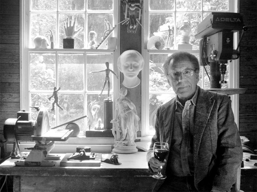
Joe Landry in his studio
Photo credit, Joe Landry
Joe Landry recently wrote a comment on a post I made a few years ago about the still-life painter Barnet Rubenstein, a highly influential painting teacher at the Museum School in Boston. I was impressed with this comment and Landry’s extensive knowledge about the history of teaching painting at the Museum school so I googled him to see what kind of work he did. It was a surprise to discover that not only had he taught at the Museum School for a number of years himself but he was a is a multidisciplinary artist who since 2012 has been concentrating on making hyperreal architectural dioramas. I found this intriguing and decided to write him to learn more about his background and process and see if he would agree to an interview. Much to my delight, he agrees and answered my questions with a delightfully detailed accounting of his engagement with many forms of artmaking over the years as well as a discussion about his various processes and considerations with regard to making dioramas and art in general.
Joe Landry is represented by the Kobalt Gallery in Provincetown, MA who wrote this about him on their website,
“Landry’s interest in the way the subconscious edits random experiences into personal stories that can be recalled and made into art led to the authentically detailed architectural reliefs he creates in painted basswood exacted with handcrafted, found objects, and photographic elements. Having worked professionally in medical illustration, art restoration, woodworking, environmental graphic design, and architectural photography, the combination of Landry’s diverse skills are brought into focus by referencing family photo albums, period photographs, and existing buildings ultimately actualized in the form of scaled-down versions of real property. As a participant in the diorama art movement, Landry recognizes that these common taboos – nostalgia, realism and craft – become artistic means.
Landry is a graduate of the School of the Museum of Fine Arts in Boston, with postgraduate studies at the Accademia di Belle Arti in Florence, and the Kokoschka School of Seeing in Salzburg. He has taught art and design at the School of the Museum of Fine Arts, the Nova Scotia College of Art and Design, and Tufts University.”
Laundry has a solo show at the Fitchburg Art Museum, Joe Landry: Hyper Real Estates in 2017 and was the First Prize winner in the 2016 81st Annual Regional Exhibition of Art & Craft at the Fitchburg Art Museum. He currently has two new pieces in the upcoming Fitchburg Art Museum’s 85th Regional Show, Fitchburg MA, which runs through August 2021.
Larry Groff: What lead you to become an artist? Did you draw and paint as a child?
Joe Landry: During World War II, when I was four, my folks picked up a sailor hitching a ride on U.S. Route 1. He’d been home on furlough and was making his way back to his base down South. My Dad put him up for the night, drove him to Boston’s South Station in the morning, and paid his train fare back to his base to ship out on time. That evening the sailor entertained me by drawing—an American Indian (so-called then) in full headdress, and a military Jeep. Both are drawn in profile. That was it. I found my calling. I can still reproduce the drawings from memory.
Five years later, then in fourth grade, with drawing all that I did well, my teacher recommended to my parents that I take Saturday art classes. In the Boston phone directory, they found the Scott Carbee School of Art. Scott Carbee was a student of William-Adolph Bouguereau and had exhibited in the Paris Salon. His may have been the last art school in Boston based strictly on the teaching method of the 19th century French Academy—as if time had stopped. The school may be best remembered today for student Arshile Gorky, who became so frustrated with the school’s rigidity that he ripped his work up and walked out. Still, for me, a nine-year-old kid in a professional art school for adults, the experience continues to nourish. The school went out of business at the end of that school year, and I moved on to the Children’s Saturday Art Classes at the Boston Museum of Fine Arts. I continued there on Saturdays for the next eight years until I graduated from high school, and entered the School of the Museum of Fine Arts, very well prepared.
The world of the grammar school class, where we may first find our place among our society’s cast of characters, is largely a world of words, of reading, writing, and talking. This can be difficult, for example, for the athletic kid whose intelligence may be more physical; or the class artist kid who’d rather be making things to look at. Such “left-brained” deficiency, if that’s what it is, is certainly not universal among visual artists. I have painter friends, who also write, and can talk the ear off a brass monkey. But some kids who eventually stick with art, really do seem to be more “right-brained,” non-verbal, and introverted than others. My good fortune was having grammar school teachers, and supportive parents, who got it. There’s heavy-duty writing on this subject in Rudolf Arnheim’s “Visual Thinking;” and, more recently, in the brilliant and expansive, “The Master and his Emissary: The Divided Brain and the Making of the Western World,” by Iain McGilchrist. Possibly most concise and entertaining, though, may be Susan Cain’s Ted Talk, “The Power of Introverts.”
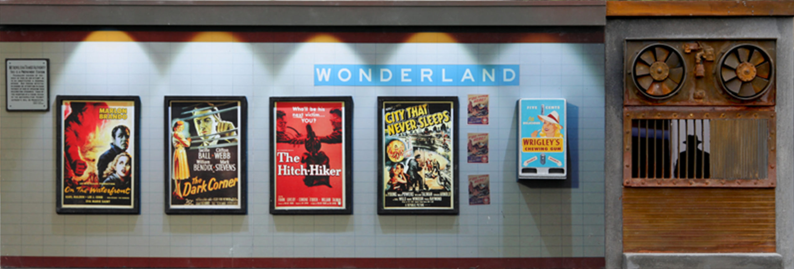
Wonderland, 2018, Mixed media, 13x38x9 in. (1/8 scale)

Wonderland, Interior view
LG: I understand you studied at the School of the Museum of Fine Arts in Boston in the ‘60s. Can you tell us something about what that was like for you?
Joe Landry: It was like being given wings. My student years at Museum School, 1958—1962, were just before a time of major change at the school. It was still the academic drawing school of Elsworth Kelly and Jim Dine. And its rigorous first-year program remained a demanding bootcamp: Twelve hours of drawing each week—from basic forms to the figure; and courses in pictorial composition, perspective, artist’s anatomy, painting, figure modeling, and art history. The painting major program, beginning the second year, by intent or by coincidence, practically walked students through the history of painting. Second year: Trompe l’oeil with Henry Schwarts: color glaze over grisaille technique. Third-year with Jason Berger: painterly Impressionist landscape. Fourth-year with Jan Cox: Modernism. There were some problems due to the School’s strict departmental structure. For example, a third-year painting student whose work might be evolving into 3-D, might have to go back to the beginning of the second year and change majors in order to take a sculpture course. Such conservative regulation also kept photography (not considered art!) from the school years later than its introduction at other art schools. And this may have led to the backlash of the School of the late 1960’s—when I began teaching—with the individual course, rather than closed departmental tracks, becoming the modular building block of more individualized art education. This was the Museum School of Nan Golden, Alex Gray, and Mike, and Doug Starn, who might have been dismissed from the Museum School of my own student years. Howard Gardner’s idea that a varied faculty is best because it makes it more likely that a student with a particular best learning style, may be matched up with a teacher with a compatible best teaching style, was pretty much the goal of the non-departmental Museum School into the 1970s. But, of course, this more libertine approach had some problems as well. For me personally, studying in the old school, and later teaching in the new—going from one extreme to another—had its benefits.

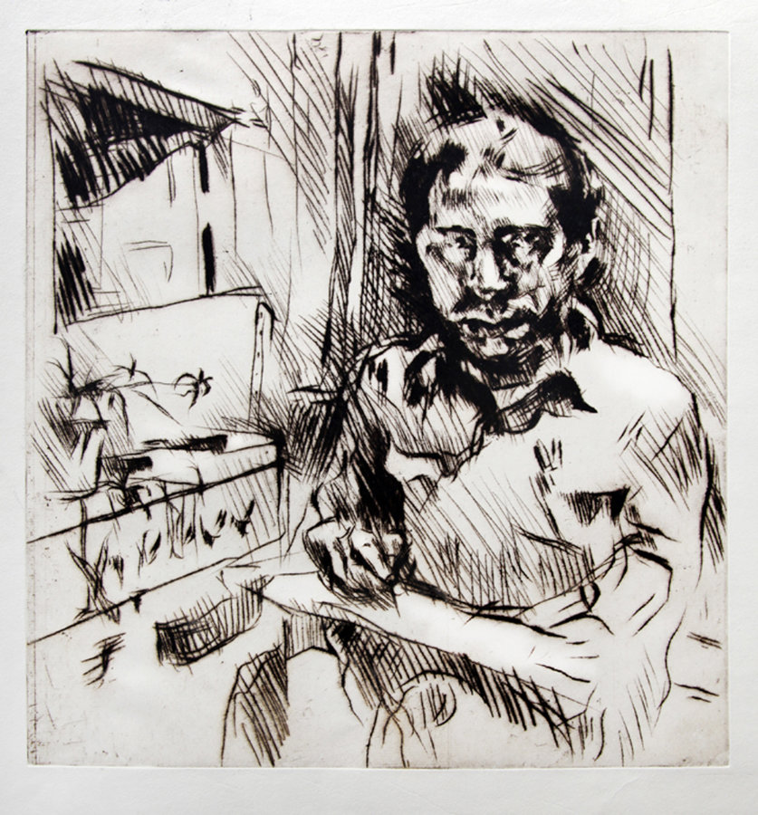
Self portrait drawing, Florence, 1963, pencil on paper, 9×7.5 in
LG: Who were some of your most influential teachers at Museum School?
Joe Landry: (I might make a splash and say, Marcel Duchamp! But I only shook his hand after an impromptu talk he gave during a quick visit to the school.) Joseph Cappicietti was my drawing teacher during the last three years of my Museum Saturday Classes and my first-year teacher of drawing when I entered Museum School. Joe could draw a skeleton in any position, viewed from any viewpoint, and then add the mussels! He was the kind of virtuoso draftsman, who, if born in another age, might have hung out with Andrea Del Sarto. Elenor Barry, and her intense and comprehensive course in pictorial composition, was eye-opening for me. It was said that if you took Elenor to a frozen pizza warehouse, and pointed to one particular pizza, that she’d be able to find it, among hundreds of others, a year later. Most influential for me, however, due to my primary interest in design at the time, was William Bagnall. Bill was an inspiring design teacher at the MIT, and Harvard schools of architecture, as well as Museum School. And an architect who designed interiors and furniture for Paul Rudolf and Jose Louis Sert, among others. Bill later became the Dean of Museum School—a controversial one to say the least. I’d been working as a staff illustrator at Harvard Medical School for a couple of years, when he offered me a full-time faculty position at Museum School to teach courses that were new to the school at that time, creative offset lithography, and photo-silkscreen, as well as traditional drawing, design and typography courses. The position also covered designing Museum School’s catalogs and exhibition posters. Bill’s strong personality teaching approach bordered on inciting a cult-like following on the part of his students. His critiques could be wilting, sometimes delivered simply as a groan, as if unsuccessful work gave him cramps. So students would pull all-nighters before his classes to avoid that, and in hope of earning that half-smile that said, “This is not all bad!” (Years later I thought of Bill’s teaching when I read about Stockholm Syndrome.) Many years after he retired, Bill visited the School with his grandchild. Few people in the school’s atrium that day knew who he was, but I was very glad for the chance to thank him.
Self portrait print, after Salzburg, 1966, drypoint etching, 12×11 in.
LG: Did you start off as a painter?
Joe Landry: I started off as a painter as kids usually do, with crayons and colored pencils; but also making things with clay and blocks. In my Museum of Fine Arts School student days, all students had painting and drawing courses each term of the four-year program. By graduation, even students majoring in non-painting idioms might have had as much painting instruction as painting majors at some other schools. I balanced courses in design with fine art courses. It was only during my Museum School Travelling Scholarship years, studying in Florence, Nottingham, and Salzburg; and for a year after that, in my studio in Boston’s North End, that painting was a primary focus. For better or worse, I’ve never been attached to one idiom for long. Hopefully the label “multi-media artist” gets me off the hook.
LG: At some point you studied with Gyorgy Kepes, what was that like? Did your studies with him influence your art significantly?
Joe Landry: I had two courses with Gyorgy Kepes in my fourth year at Museum School. This was part of a limited exchange program that Museum School had with the MIT Graduate School of Architecture at that time. The courses were “Advanced Visual Design,” a first-term course. This course, working largely with photograms, was based on courses taught by Gyorgy Kepes and Moholy-Nagy at the New Bauhaus in Chicago in the late 1930s. The second course, taught the second term, was “Light and Color.” In this course we worked with model building like constructions, gel color filters, and spotlights, to create color compositions in the medium of light. I came away from these courses very impressed and influenced by the broad range of the teacher’s own expansive work in painting, photography, design, and pioneering electronic environmental art. And by his light murals for, among others, Radio Shack in Boston, and Royal Dutch Airlines in New York; and the way this work took art out of the gallery and into the public sphere.

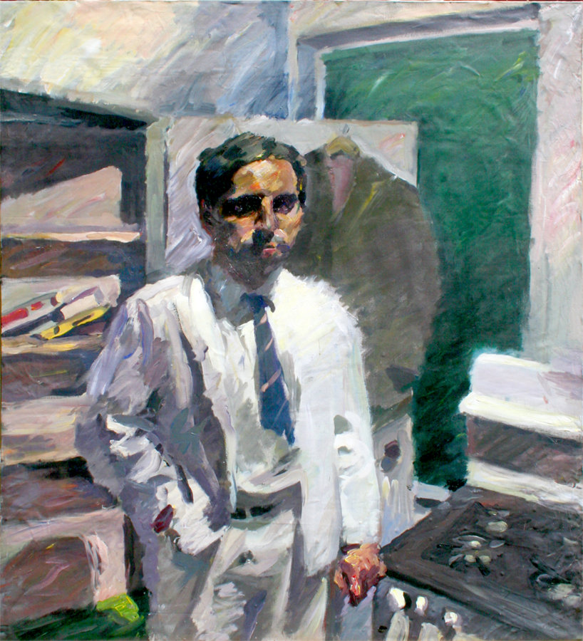
Self portrait painting, Florence, 1963, oil on panel, 36×30 in.
LG: You also studied at the Kokoschka School of Vision in Salzburg. That must have been an amazing experience. I read that Kokoschka was a painter important to a number of the Museum School faculty who embraced the spirit of Expressionist painters like Kokoschka. In what ways, if anything, did your study at the Kokoschka School influence your visual thinking over the years?
Joe Landry: In Salzburg I learned that expression may be in the distortion—best unconscious while striving to get the painting right. The International Summer Academy of Fine Art was superb; with serious art students arriving from all directions, to paint in a castle on a mountaintop. The Museum School’s connection with German art may have begun as early as the School’s founding with German artist Otto Grundman at the helm.
There’s a theory that Northern European art may have evolved from the detailed magic realism of book illumination (leading to Durer); while Southern European art may have evolved more from fresco painting, with its necessary attention to contour and the flat interlocking shapes of the giorno [Giornata] (leading to Raphael). Some even see this contrasting distinction carried forward to Beckmann vs Picasso. Art historians are knowledgeable across the broad realm of art history. Artists, however, may be more inclined to only know a lot about those artists and periods that may best nourish their own personal art. For the artist, it’s like taking vitamin C. Your system absorbs what it needs, and passes the rest.
So, unburdened by any comprehensive knowledge of art history, here’s what I think: In the early 1940’s a new Head of Museum School, Russel T. Smith, was tasked with bringing the school into the modern era. He may have decided that modern German art, based on abstracted realism, would be more fitting for Museum School, with its realist traditions, than the non-objective abstraction that was just beginning to prevail at other art schools. Oskar Kokoschka was invited to teach at the School for a summer session in the Berkshires (Possibly the origin of his summer school in Salzburg a few years later). Max Beckmann was brought to the School to lecture. The first retrospective of the work of Ernst Ludwig Kirchner in America was shown in the School’s gallery. And German expressionist Karl Zerbe was appointed to head the Museum School’s painting department. Many Museum School students later traveled to Kokoschka’s School in Salzburg. Unfortunately, in my case, Kokoschka retired between the time of my application and arrival. I had hoped to collect some of the jellybeans that OK awarded students when they did well. A side note: I’ve read that Museum School student David Lynch had also applied at that same time, but chose not to stay when he learned that OK would not be teaching.
Self Portrait Painting, after Salzburg, 72×65 inches, 1966
My painting teacher in Salzburg was Rudolf Szyszkowitz, a German expressionist painter that OK chose to be his replacement. This time, 1965, was a turning point for the Salzburg School. And the great Italian abstract expressionist Emilio Vedova became the dominant figure of the painting faculty. In those days, you might have needed to be a student whose natural artistic voice was in realism, to understand the power of the new abstract expressionism—when imposed as dogma by some historians and critics at that time. But then “Pop Art,” put its foot in the door. For my needs, Rudolf Szyszkowitz’s teaching was very solid and enabled me to win The Prize of the City of Salzburg—awarded to a number of Academy students by the city each year.
Having studied with art teachers in Florence who didn’t speak English, I found that trying to communicate about painting, without spoken language, actually had some advantages. The lanky, and near seven-foot tall, Emilio Vedova, critiqued student painting largely with gestures, looking like a giant octopus with one tentacle stuck in a light socket. You can find ways to communicate that may be more memorable than just saying. For example, during a day of landscape painting on one of the Salzburg castle’s abandoned ramparts, a kind of leafy oasis floating high above the city, I kept flooding my work with yellow—as if the sunlight were yellow! Prof Szyszkowitz pointed to a particularly acrid yellow passage, and whistled like a canary!

Alleyway, 2021, Mixed media, 16x35x9 in. (1/8 scale)
Alleyway Interior view
LG: How were you able to have so many interesting professional disciplines? Such as medical illustration, art restoration, woodworking, environmental graphic design, and architectural photography. All of which would likely be excellent skillsets for your diorama art-making.
Joe Landry: Design and craft, making all kinds of things well, came more naturally to me than the highly focussed calling of painting. Painting, in my case, finally became just one more thing to take a turn at. I don’t recommend this. But for me, one idiom has always led to another. For example, in photography: a class assignment using the 4×5 camera led to taking pictures of buildings like a professional; which led to street photography, and freelance news work for the “Boston Globe;” which led to an interest in making “underground movies;” which led to a PBS grant to make a documentary film. And now to use photography in my diorama work. This broad experience with many idioms also came in handy teaching at Museum School, where teachers are called upon to critique the artistic merit of all kinds of work during Review Boards at the end of each semester. I’m like the druggist who had wanted to be a doctor, but became the soda jerk who invented the banana split!
LG: What led to your involvement in dioramas?
Joe Landry: When I was a kid, the biscuits of shredded wheat packed in the cereal box were separated by cards. For a number of years, these cards came with building plans printed on them that could be cut out and folded into small standing houses and shops. If you ate enough shredded wheat you could construct an entire miniature town. Some of us reach a time in life when there’s a lot more behind us than ahead. And the lost kingdom of childhood, “another world that’s in this one,” can be worth revisiting in search of subject matter (this used to be called “second childhood”).
There were also practical matters leading to my diorama work. Work that I was doing out of my design studio in Harvard Square, for a number of years, in environmental, display, and product packaging design, led to putting together a model-making shop for fabricating mock-ups. And then when my two boys came along, I made further use of the shop to set up a crafts business with them. I wanted to pass on to them some of the skills that I picked up from my own father, who built sailboats. My parent’s generation took part in the migration from the city to the country during the 1950s, with the country quickly exploding into the suburbs. The high school in the former dairy farm town that we moved to still offered a Practical Arts track. Being a poor academic student, aiming for art school rather than college, I chose Practical Arts. This provided four years of excellent shop courses in drafting, letterpress printing, sheet metal, and woodworking. A visit to New York in 2011, and an exhibition of miniature diorama art at the Museum of Arts and Crafts, “Small Worlds and Optical Delusions,” suggested possible new applications of these skills.
Orient Palace, 2014. Mixed media; 29 x 18 x 4 in. (1/12 scale)
Orient Palace, detail
LG: How do you go about deciding what to make?
Joe Landry: Unless you’re a celebrity, few people will be interested in your own personal history, or the settings in which it played out. But such personal interest may drive your artwork. And if your work is convincing enough, it may transport the viewer back to their own personal history. Whenever I walk across the particular street in Boston, where my dog was run over when I was a kid, it practically vibrates with intensity—no matter how mundane this setting appears. If I made a miniature diorama of that unremarkable location, without adding a patch of blood, or any other giveaway, would the viewers share my childhood horror on some level, even be reminded of one of their own? I think so. This might have to do with paying such obsessive attention to a subject that, on its face, appears utterly insignificant, that significance is somehow conjured—as if by magic. I generally choose subject matter with three questions in mind. Does the subject or location strongly evoke past experiences—like Proust’s Madeleine? Is it something I’d enjoy making, the way a vocalist might enjoy singing a particular song? And, will it capture the eye of gallery visitors. I’ve found that meeting this third requirement is easier with my miniature art than with other kinds of art that I’ve shown.
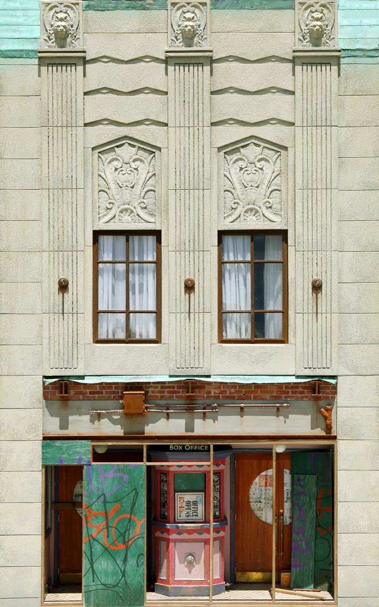
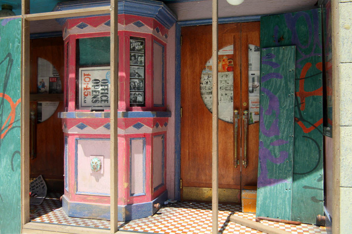
I’ve also ventured through a number of different approaches that have also determined subject matter. The earliest pieces were nostalgic. For example “Orient Palace,” based on my neighborhood movie theater when I was a kid. Or, from my free-range childhood, “Watch For Trucks,” the garage of a nearby junkyard owned by a man with one eye. (I learned that I could play there all day, as long as I stayed to his left—the side of his missing eye.) Then I did a number of pieces based on playing a kind of game. The great book on pictorial composition for artists, Earl Loran’s “The Compositions of Cezanne,” examines a variety of Cezanne’s paintings. Each in three takes 1. A photograph of the original motif (still largely intact when Loran did his research) 2. A reproduction of the Cezanne painting and 3. Diagrammatic analysis of the painting’s compositional structure.
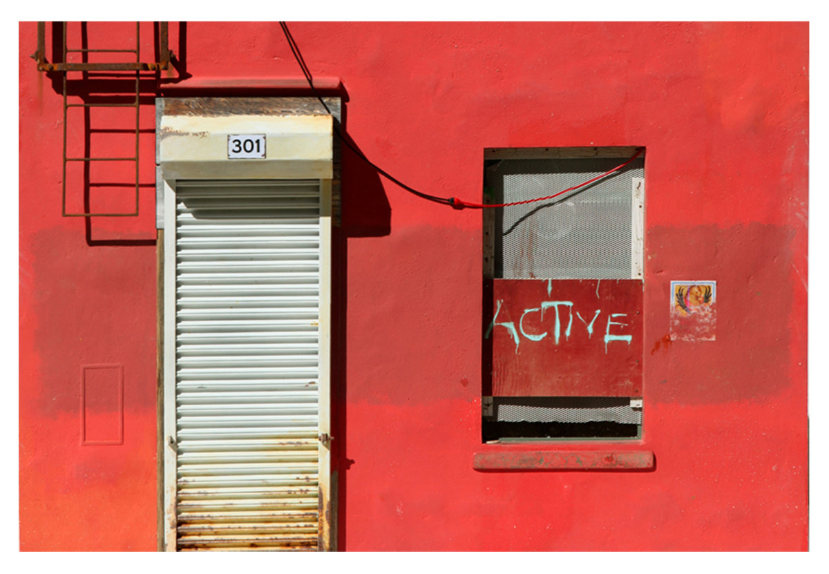
The game I played was to envision, as in Loran’s photos of original motifs, what the original motif may have looked like for a number of artworks that I admire. For example: “My Rothko” envisions a cool red stain on the warm red facade of a closed pub that may have inspired (who can say?) Rothko’s painting “301.” “Hotel Beauclair” envisions the original motif of both Edward Hopper’s “Drug Store,” and his “Hotel.” “Perkin’s Shop” envisions what the subject of Edward Weston’s photograph “Corrugated Tin Facade,” might look like eighty years after he took the picture. I’m also thinking of making a miniature diorama of the corner of the Piazza Santa Croce, in Florence, that DeChirico identified as the inspiration for his first metaphysical painting. With my most recent work, I’ve been creating miniature theatrical sets with figures as actors. Roy Anderson’s film work has influenced this direction, though I’m not aiming for anything quite so weird.
At this time I’m giving some thought to making new pieces that invite hands-on viewer interaction. Viewers have sometimes broken parts of my pieces by trying to open doors and shutters to look inside. There may be a creative way to channel that interest. When I was studying in Florence in 1963, I got an invitation to the opening of a show of drawings by George Grosz. This was at a gallery in the Piazza Santa Croce that was one of the few in Florence showing 20th-century art. Police were standing out front when I got there, and people going in and out of the gallery looking amused. What happened is that a priest, I was told, had wandered into the gallery from the nearby church; and was so appalled by the Grosz drawings that he called the cops! And, with Fellini-like creativity that could only happen in Italy, one of the policemen came up with a solution that satisfied everyone. He bought a box of bandaids at a nearby pharmacy and stuck them over the offending parts of the George Grosz drawings—right on the picture frame glass. When I entered the gallery viewers were peeling the bandaids back, taking a peek, and then sticking them back down again. Lines of visitors were forming to take part in the peep show, which very much amplified the voyeuristic nature of the work. I might try something like that with work.
Demuth Business, 2016. Mixed media; 29.25 x 29.25 x 4 in. (1/12 scale)
Demuth Business (Detail: view in window)
LG: How do you go about planning the work? Do you work out the compositions from drawings on paper or the computer or use a maquette of some type? What materials do you use? Can you walk us through your overall process in making a diorama?
Joe Landry: I fabricate two exact copies of each piece that I make, duplicating component by component as I proceed—one for gallery sale, and one to keep. The steps preliminary to final construction, such as research; extensive drafting of plans; making castings, jigs, and patterns, compiling materials, mixing colors, etc. are the most time-consuming; and can be applied to one or many pieces. Making only one piece would be something like creating an assembly line to make one Ford. And while it may seem that making two would take twice as long; in fact, it only takes about time and a quarter.
After locating and photographing the general subject, say, in an old neighborhood, or exploring a city via Street View, I make a bunch of pencil sketches. Then I do research online, often finding patent drawings for various elements—researching the detailed look of things. The next step is drafting full-sized plan and elevation drawings. These become the master plan. Then I turn to the computer and draft detailed plans of every component that will be included in the final piece. These very exact drawings are then printed on crack and peel adhesive paper to adhere to the basswood, aluminum, or plastic stock materials. Signs and other graphics are composed in the Illustrator Program. Any photographs of textured surfaces that might be applied to components, such as plywood grain, are processed in Photoshop and printed for application. Any sculpted elements are completed in polymer clay and cast in lightweight hydrostone plaster. Metal elements, if any, are fabricated and soldered; and any elements to be turned on the lath are completed. Any 3D figures are scanned and printed. Finally, it’s all assembled, and painted. (Trying to put these steps in writing reminds me of a fable: The ant observes the centipede walking by and is amazed. It asks the centipede, “How can you walk with so many legs?” The centipede stops. And thinks about it. And can’t walk again!)
LG: What are some considerations for light in your work? Do you sometimes wire actual lights in the work? What role does light play with your use of color and form?
Joe Landry: One of the best examples of just how much can be done with electric lighting fixtures that plug into the wall is the work of master diorama artist Alan Wolfson—who, I believe, is also an electrician. The lighting effects in his work are as dramatic as anything you might see in a first-rate theatrical production. I’ve avoided that much electrical work, however. One problem is that in order to be exhibited by a commercial gallery your work has to sell. And, I’ve found that work that plugs into a wall, mine at least, doesn’t. So I’ve been playing with light in more limited ways. The first is to insert semi-transparent, opal plexiglass panels, and fresnel filters, into openings on the top panels of my pieces. In this way, the available gallery or home lighting can be directed to the interior features of my pieces. A recent piece, “Terminal Warehouse,” works this way.
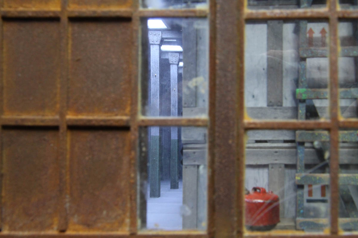
Through the Peephole, 2018, Mixed media, 16x34x9 in. (1/8 scale)
Through the Peephole, Interior view
In other recent pieces, I’ve been adding the option of rechargeable battery-powered lights. I figure, given that we’re all accustomed to charging our phones, that this might work out. Recent pieces, “Alleyway,” and “Hotel Beauclair” offer this lighting option. In a couple of pieces, I’ve used a kind of airbrush effect in Photoshop to create the illusion of light on the surface of facades. “Through the Peephole,” with light spilling through venetian blinds across a wall, employs this device. And also in the piece “Wonderland,” printed spotlight effects illuminate a row of subway posters. This technique has worked surprisingly well, with some viewers moving their hands in front of the piece to try to figure out where the light—which is actually printed—is coming from. Such illusions can be very convincing, as long as they provide enough “evidence.” It’s like the cat chasing the laser pointer light around the floor. Kitty knows that it’s not a real mouse. But the light’s movements are close enough to that of a mouse to provoke an instinctive reaction.
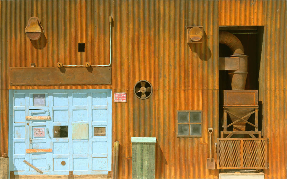
Perkins Shop, 2012, Mixed media, 18x29x4.5 in. (1/12scale)
Perkins Shop Detail
LG: What are some of your considerations with regard to the texture and tactile qualities of forms? How important is it that things seem completely real?
Joe Landry: Texture plays an important role in creating a convincing illusion in diorama work and may help take the work beyond more pristine architectural modeling and into a narrative. However, a mere suggestion of texture can go a long way. And, as in drawing, it may work best when subordinated to the underlying form. Otherwise, the texture may just camouflage. I avoid taking weathered textures to the extreme of grunge, as some diorama artists do. Though there can be expressive value in such excess, for example, in the paintings of lvan Albright.
LG: Would you consider it acceptable to use 3D printing for elements in your work? Is digitally created materials and forms something that is frowned upon by diorama artists?
Joe Landry: I aim for maximum realism in my work and find that I can best reach that goal by utilizing 3D scanning and color printing technology for the figures that may appear in the work. I pardon this “cheating” by thinking of it as 3D photography, and by considering the work of sculptors, like George Segal, who use body casting instead of figure sculpture modeling. Still, I greatly admire and enjoy the figure modeling virtuosity of diorama artists like Joe Fig, whose recreations of the studios of contemporary artists include masterfully modeled renditions of each artist. Bravo.
The startling realism of the 3D printed figure can cause problems though. If provocative ambiguity creates mystery in one’s work—urgent questions posed but left to the viewer to answer—the 3D scanned and printed figure, in being so unambiguously what it in fact is—a figurine—can be an impediment that resists playing a part in a greater narrative. To solve this I’ve found that obscuring 3D printed figures, placing them in the dark, or behind a screen, for example, can make it easier for the viewer to get past stopping in their tracks to marvel at miraculous computer technology, and to identify with a character playing a role. In “Duck Soup,” Chico Marx says, “Who ya gonna to believe, me or your own eyes?” The question is, how—as an illusionist working with artifice—can you maneuver the viewer into believing Chico?
Delicious Violation, 2015. Mixed media; 27.75 x 37 x 7.75 in. (1/8 scale)

Delicious Violation (Detail: mail box, coffee cup, and parking ticket)
LG: I’m intrigued by how you set up situations for color to interact with the surrounding colors in your compositions. Can you tell us something about the role of color in your works?
Joe Landry: The best “book” I’ve ever read about color is actually a single quote by Eugene Delacroix: “I can paint you the skin of Venus with mud, provided you let me surround it as I will.” Based on mostly drawing as a kid, I brought with me to painting classes at Museum School the misconception that a painting was a black and white picture colorized. Using color didn’t come naturally. Like designers, I’m inclined to use color as applied, more than essential form, as most painters do. As a student, I found a number of lessons very helpful. For example, Josef Albers’ “Interaction of Color,” and color courses that are based on his book. Also, doing four color CMYK separations of color photographs for offset printing. It’s always surprising to see how faint the black plate is, and how it takes all four colors superimposed to create a deep black. And then, developing a thorough understanding of the Oswald Solid color theory—which carries the color wheel, and our thinking about color, into three dimensions.
It also clarifies that there are only three questions to ask when a color, or its surrounding, isn’t performing well: Should it be a different color? Should it be lighter or darker? Should it be brighter or duller? Finally, the color/sound work of painter and type designer Karl Gerstner, who used the Ostwald Solid the way an organist uses the keyboard; and the sand and oil paintings of Gyorgy Kepes, have been an inspiration. Both of these artists were masters of simultaneous contrast: “The very heart of painting,” according to Josef Albers. Also, their work offers a compendium of riches to crib. In a lecture, Gyorgy Kepes once said, “It’s alright to pick flowers from other’s gardens, as long as you make your own bouquet.” (Sounded much better delivered with a dense Hungarian accent.)
LG: How Long do you typically spend to make a piece? How do you sustain your stamina over these long periods?
Joe Landry: I can complete a piece in about a month, though it’s hard to say because I work on more than one piece at a time, and might put a piece aside, and then pick it up again much later. Covering new ground with each piece creates new technical challenges each time so that the work doesn’t become rote. Viewers sometimes say, “I could never do what you do because I wouldn’t have the patience.” Actually, it has little to do with patience or stamina. It may have more to do with some kind of neurotic compulsiveness to keep making stuff and lurking postpartum blues if you stop. A kind of programming, like Charlie Chaplin’s in “Modern Times,” tightening bolts in a factory all day long. Then, walking home after work, wrenches still in hand, chasing a woman who has buttons on her coat that look like bolts.
LG: I’ve read where a few diorama artists don’t consider the sculpture to be the finished piece and instead consider the photographic print of the set-up to be the actual artwork. They then will recycle or discard the physical forms. Would this approach ever interest you?
Joe Landry: I’m familiar with the work of a number of diorama artist photographers who work this way. The diorama-based photographs of Lori Nix and Kathleen Gerber, as well as the photographs of Michael Paul Smith are especially powerful. I may try working this way myself in the future.
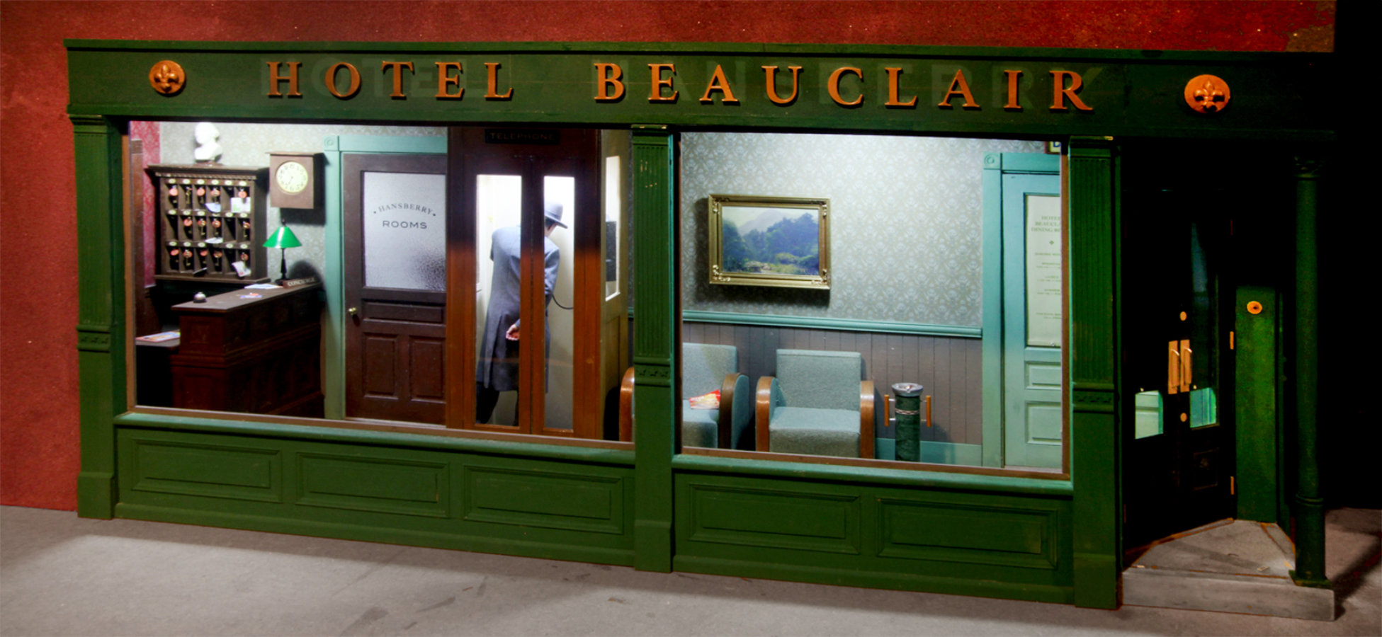
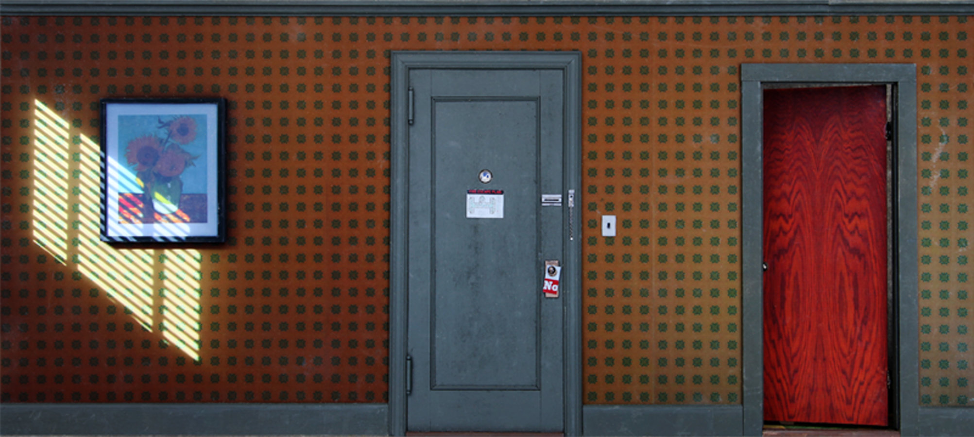
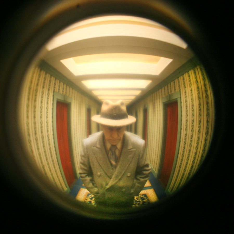
Hotel Beauclair, 2021, Mixed media, 16x38x9 in. (1/8 scale)
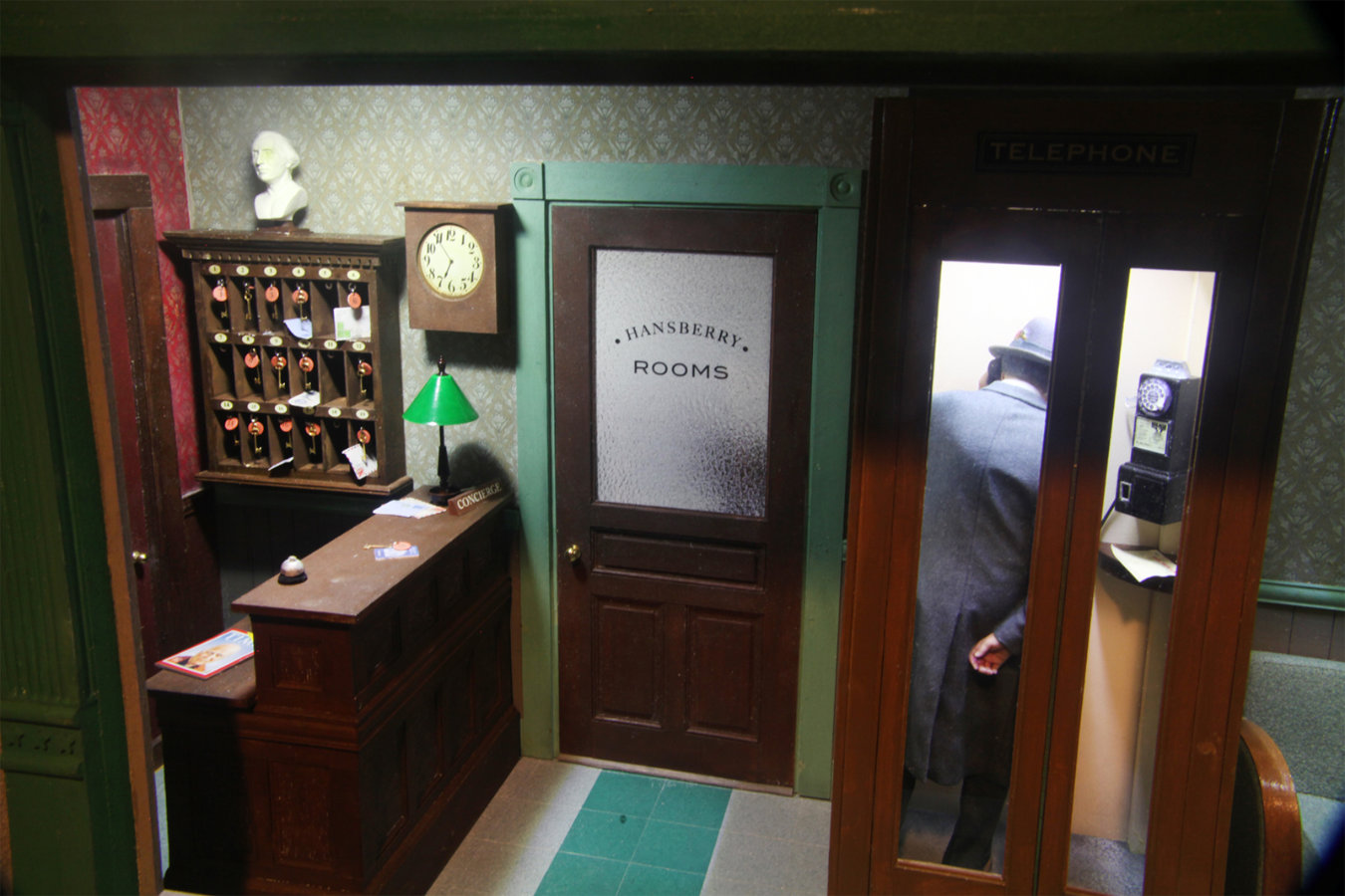
Hotel Beauclair, Interior Detail
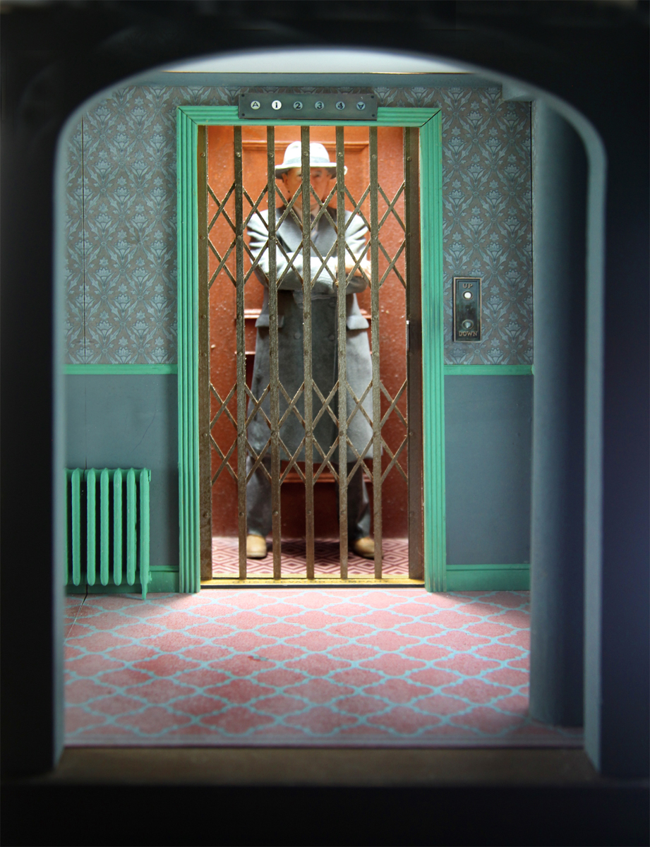
LG: In your recent works, such as “Alleyway” and Hotel Beauclair” is the figure meant to be a self-portrait? What can you tell us about the meaning? These are details of works in progress but will they be displayed together as you have in the photo, perhaps to suggest a storyline like sections in a cartoon?
Joe Landry: The figures in “Alleyway,” and “Hotel Beauclaire,” are actually 3D scans and prints that I had made of myself, for reasons of convenience; but are intended to be more generic—something like Rene Margritte’s recurring figure in the bowler hat. But now, in my work, wearing a fedora, typical of the 1940’s and 1950’s—the alternate world of my childhood. I’ve hung gallery shows of my work with each piece closer than usual in galleries, and with each piece on the same baseline, to suggest a street of buildings. In more recent work I’ve tried to suggest the development of narrative sequence across a number of pieces. For example “Wonderland,” “Hotel Beauclair,” “Alleyway,” and “Through the Peephole,” are intended to be an episodic journey, a kind of “Rake’s Progress,” of one character. A west coast couple who collect my work has bought this complete sequence—which I may continue to expand.
LG: Many painters, especially those who embrace modernistic principles, try to simplify details to better reduce things to their most essential visual form. Would you say that your photorealistic approach runs contrary to this aesthetic or do you also share this concern on some level?
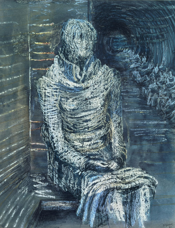
Woman Seated in the Underground, 1941 – Henry Moore
Joe Landry: I’ve always thought that abstraction, the distillation of images to their essence, was the basis of monumentality in art. For example, in Henry Moore’s masterful ink, wax crayon resist and wash drawings of the London Underground during World War II, when subway stations were used as bomb shelters. The figures in these drawings, as compared to photographs of the same subject, are highly depersonalized. In one of the photographs of Henry Moore drawing in the subway, there’s a woman sitting on steps, gazing up at him with a look of affection. She’s a very particular individual, wearing a hairstyle and shoes that set the scene in the 1940s. It’s an image of a person having very specific thoughts at a very specific time. You can almost imagine the sound of her voice, should she ask if you’d like a nice cup of tea.
In another Henry Moore drawing of this same scene, all such specificity is erased. The figures are rendered as volumetric crowd forms, as if dressed in togas, with the stairway now suggesting temple stairs. No one is depicted, so that the figures may stand for everyone and the heroism of an entire people. The ordinary becomes monumental. Ancient Egyptian art of deities seemed to use abstraction in this same way. Then, when driving to work one morning, listening to NPR, a writer was interviewed who had a very different theory. She seemed to believe that it was in the details, in the specificity, that we find connection with others through our art. If I painted a portrait of my grandmother, one that included a very particular embroidered pattern on her apron that I recall, this painting might not stand for all grandmothers. But it might bring to mind your own—the one and only. The writer’s point reminded me of Ludwig Mies van der Rohe famous quote, “God is in the details.”
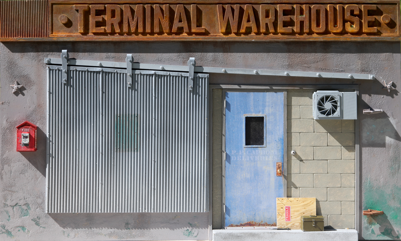
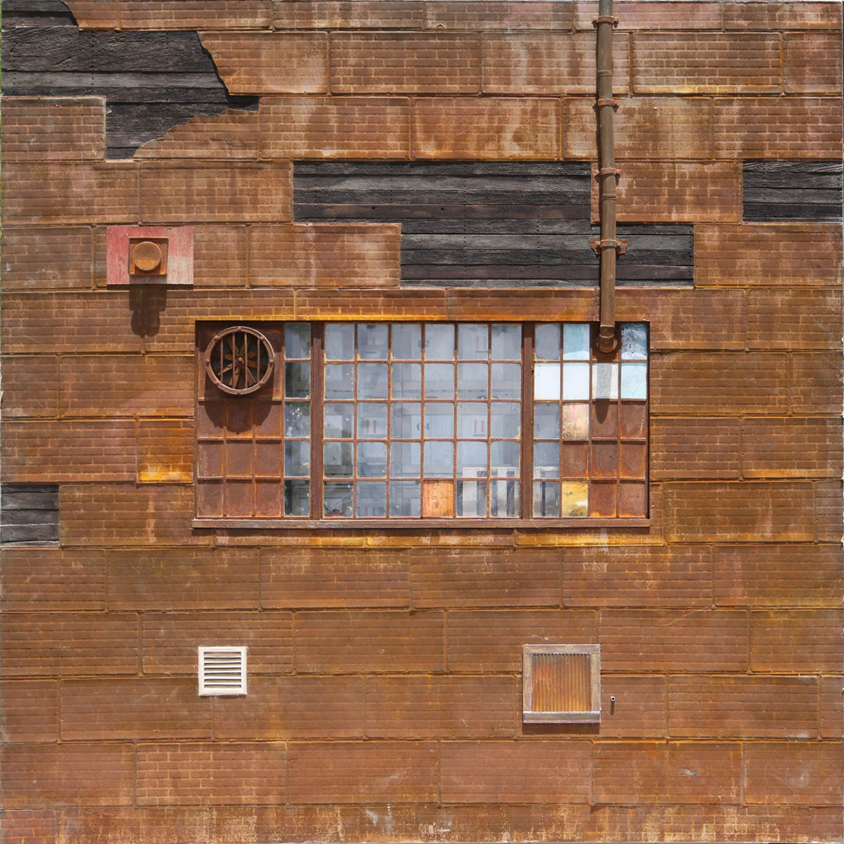
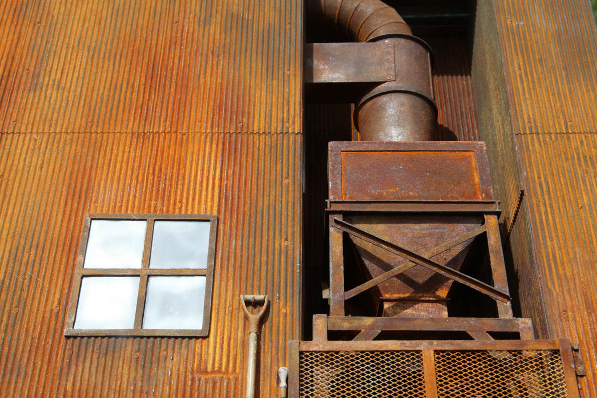
Terminal Warehouse, 2020, Mixed media, 17x30x8 in. (1/8 scale)
Terminal Warehouse, Interior Detail
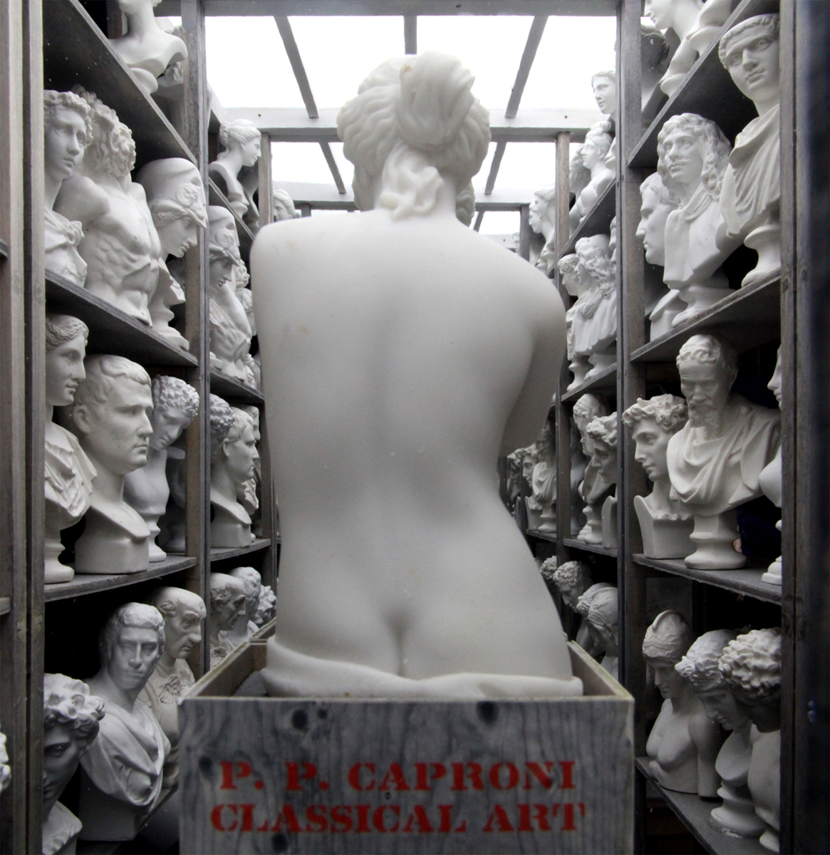
LG: Your photo of your new work “Terminal Warehouse”, shown along with the storage room with the classical statues. PP Caproni & Brother, labeled on the crate, were the leading company making plaster casts for art schools and universities back in the early part of the last century. The Pennsylvania Academy of Fine Arts used Caproni casts as models for their art students to draw from. I’m curious to know more about this piece. Would you say this is a statement about the art world’s loss of interest in traditional artist study?
Joe Landry: I came across the actual Terminal Warehouse (“Terminal” referring to railway terminal) with its gloriously corroded sign, in Greenpoint, Brooklyn, just down the street from the “Capture It In 3D” studio that does my 3D scanning and printing. If Beethoven composed in rust, this building would be his 9th Symphony. An irresistible subject for anyone who makes miniature facades.
The interior of “Terminal Warehouse,” with miniature classical casts on shelves, viewed through a window, is an infinity optical illusion that uses first-surface mirrors. It quite accurately reproduces a photo of the Caproni Company’s storeroom from a 1911 catalog. I’d been looking for an opportunity to use this subject in my work for some time. It has a number of personal connections for me. Anyone bringing up kids today might be appalled at the freedom that kids of my generation were given. Eight or nine-year-old friends and I would spend Saturdays using Boston’s subway system as a vast, hide-and-seek playground—all for the cost of one fare each. One elevated route flew past the Caproni Company’s Washington Street building, at the level of its large, dusty second-floor windows, providing a quick glimpse into a very mysterious world of spooky white ghosts. We’d look for it on this route. When I went to Saturday classes, age 9, at the Scott Carbee School of Art, the day would begin with a visit to the school’s cast storage room, to pick out a subject to draw for the day. I entered the School of the Museum of Fine Arts in 1958, a year or two after the School’s collection of casts were broken up with sledge hammers in the Museum parking lot—as a kind of, out with the old, in with the new ceremony. One cast of a flayed man was preserved—for anatomy teaching.
Trying to assume the meaning of visual art can be tricky. Marcel Duchamp, “Nude Descending a Staircase,” became, in one puzzled critic’s search for meaning, “An explosion in a shingle factory!” To a customs agent, Constantin Brancusi’s “Bird in Space,” became a “Handrail!” There are anecdotes about people assuming that visual art needs to have “meaning” beyond what appearances may convey. For example, Edgar Degas, tired of hearing, “I wish I could paint like you because I have so many ideas;” responding: “Paintings are made of paint, not ideas.” Or Edward Hopper being asked to speak about his work, responding, in so many words: If I could say it I wouldn’t have to paint it.
But I’m not sure that such dismissal of interpretation should apply to work that’s intended to tell a story. Just before delivering work for a Gallery show, I made the mistake of touching up one of the pieces, “Sunrise Motel,” and managed to spill a spot of brown wood stain on a curtain with a George Nelson pattern—you know, boomerang and asterisk shapes in Necco Wafer colors on a white background. I didn’t have time to fix it; so I just hoped it wouldn’t be noticed. But at the opening, a couple did notice it, and began discussing the possibility that it might be blood! And that there may have been a murder in the motel room! This may be the way narrative realism should work—engaging the viewer’s imagination with questions that can’t easily be put aside but leaving it to the viewer to invent an answer. The viewer then becomes complicit in creating the piece. So, there may be no need for me to answer your question: “Would you say that “Terminal Warehouse” is a statement about the art world’s loss of interest in traditional artists’ study?” Since you already have. It sounds good to me.
Rooms For Rent, 2015, Mixed media, 40.75×29.25×7 in. (1/12 scale)
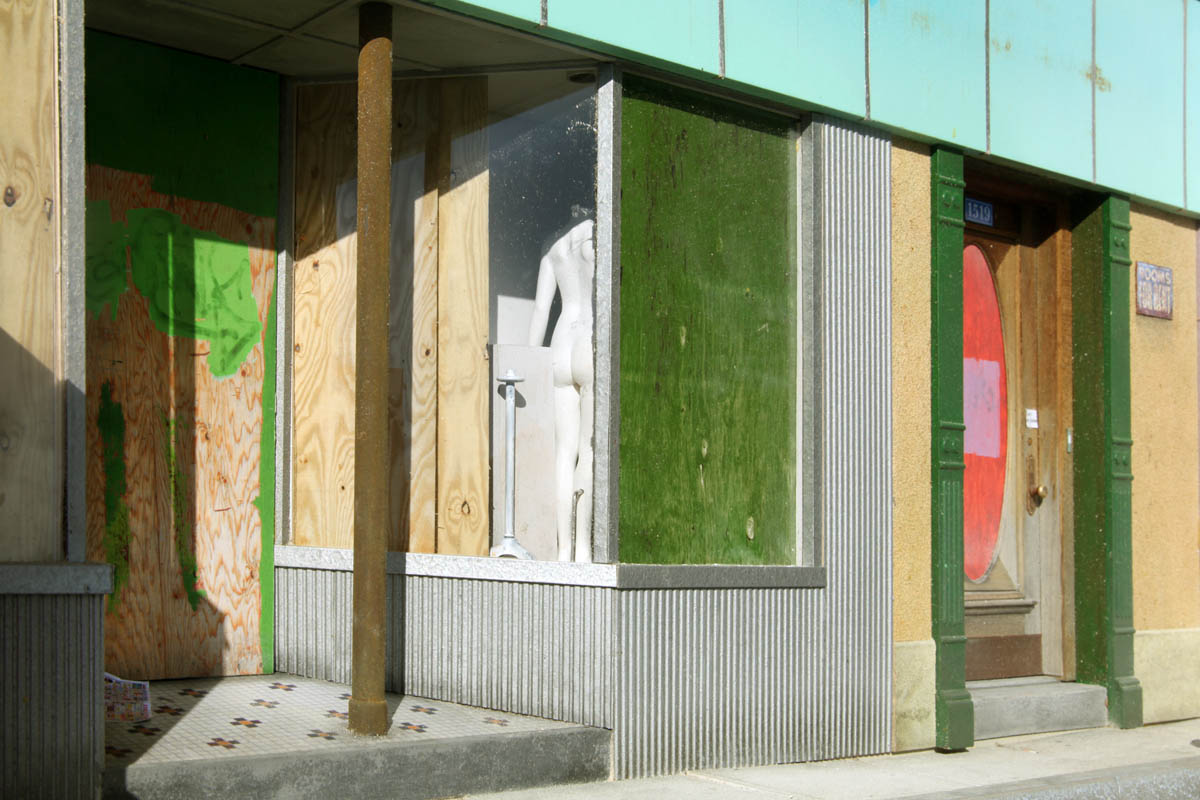
Rooms For Rent (Detail: view into closed shop window)
LG: I love that you seem to challenge modernistic dictums as in your artist statement on your website: “In this work, common artistic taboos—nostalgia, realism, and craft—become artistic means. My sculptures are personal recollections of places, brought into focus by referencing family photo albums, period photographs, and existing buildings. I strive for the highest degree of verisimilitude so that the viewer may feel transported to an actual place that has stories to tell.”
How important is your willingness to break artistic taboos? Do you consider yourself a contrarian? Is the intensity of your engagement with the subject on a personal level as well as an artistic level enough to avoid being frowned upon by formalist circles that reject nostalgia for being too safe and familiar and don’t engage the viewer enough intellectually?
Joe Landry: As a Roman Catholic parochial school kid, I was given my own Baltimore Catechism, before reaching the age of reason. This book laid out all the big questions, and gave you all the big answers; and made it clear that asking other questions, or coming up with other answers could be a sin. Fortunately, art history is usually not taught in such a dogmatic way. But some rigid proponents of, say, academic realism, or non-objective abstraction, or, more recently, conceptualism, take your pick, seem to come pretty damn close. When, as a toddler, I fidgeted in church on Sunday, my mother would sometimes whisper in my ear, “If you’re very quiet and still you’ll see the Baby Jesus when Father Toma opens the tabernacle.” I’m still looking. Maybe I’ll see Jackson Pollock!
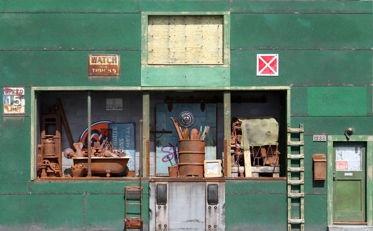
Watch For Trucks, 2013, Mixed media, 18x29x4 in. (1/12 scale)
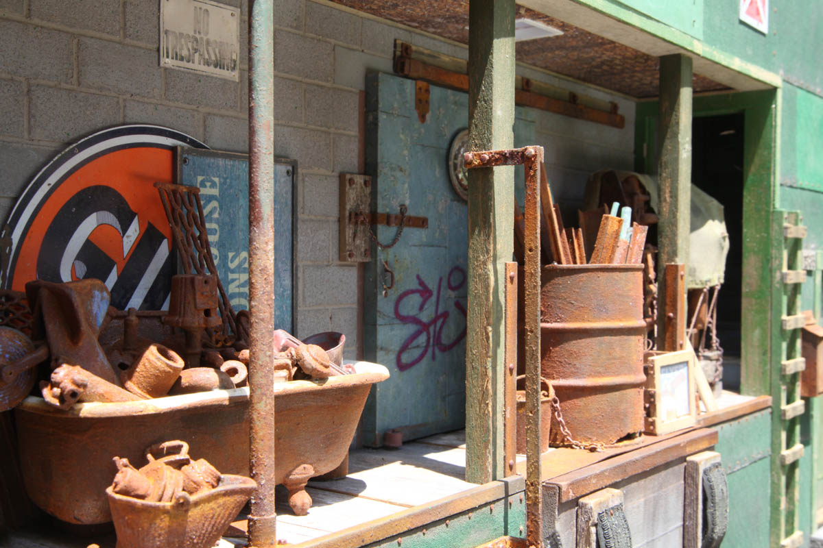
Watch For Trucks, Detail
LG: Observational painting involves scaling down a large scene into a miniature one. Figuring out how to frame the selection, get the proportions and positions in the right place, and deciding how to best edit details are concerns that you also deal with in your work. I’m curious to hear what you might have to say about how dioramas might relate to making a painting.
Joe Landry: If you made a hyper-realistic painting of the facade of a building that measured, let’s say, 12 inches tall on the canvas. And then made a wall-hanging hyper-realistic 3D relief of that same building, also 12 inches tall. How differently would viewers respond to each in turn? First, there might be different responses to the different technical facilities that each piece displayed—painting vs sculpture. But going beyond that, the painting would not likely be seen as a miniature, but rather as a painting of a full-size building—possibly as if seen from a distance. You might easily imagine yourself entering the door of the building in the painting as the full-sized person that you happen to be. On the other hand, the 3D relief of the building would most likely be seen to be the miniature that it, in fact, is. And to enter this door, in your imagination, you might need a nibble of Alice’s mushroom! So each piece, in spite of their same subject matter, might light up very different constellations of association.
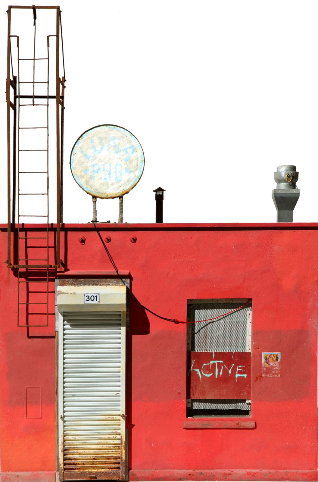
My Rothko, 2016, Mixed media, 32x22x6 in. (1/8 scale)
My Rothko, Detail
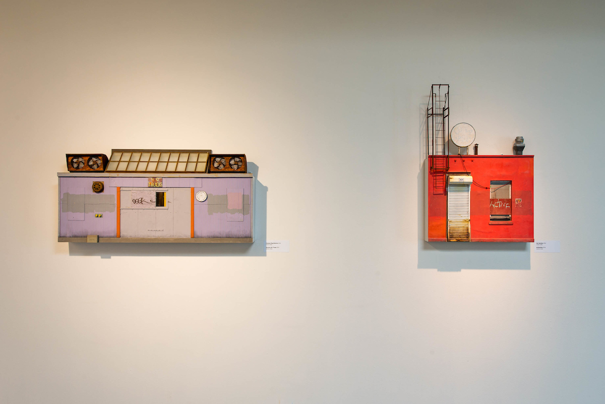
Installation view from the Fitchburg Art Museum 2017 exhibition, Hyper-Real-Estates, Fitchburg, MA
LG: You stated on your website that Gaston Bachelard’s “The Poetics of Space”, specifically his chapter on miniature, has been influential to you. This book was suggested reading many years ago when I was in art school but at the time it was over my head. However, in preparing my questions I found this link to his chapter, miniature and found this quote from it to be a very compelling read.(Link to Gaston Bachelard’s Miniature chapter
“One might devote a serious reading to this fragment by Hermann Hesse,” “…A prisoner paints a landscape on the wall of his cell showing a miniature train entering a tunnel. When his jailers come to get him, he asks them “politely to wait a moment, to allow me to verify something in the little train in my picture. As usual, they started to laugh, because they considered me to be weak-minded. I made myself very tiny, entered into my picture, and climbed into the little train, which started moving, then disappeared into the darkness of the tunnel. For a few seconds longer, a bit of flaky smoke could be seen coming out of the round hole. Then this smoke blew away, and with it the picture, and with the picture, my person…” How many times poet-painters, in their prisons, have broken through walls, by way of a tunnel! How many times, as they painted their dreams, they have escaped through a crack in the wall! And to get out of prison all means are good ones. If need be, mere absurdity can be a source of freedom.
And so, if we follow the poets of miniature sympathetically, if we take the imprisoned painter’s little train, geometrical contradiction is redeemed, and Representation is dominated by Imagination. Representation becomes nothing but a body of expressions with which to communicate our own images to others. In line with a philosophy that accepts the imagination as a basic faculty, one could say, in the manner of Schopenhauer: “The world is my imagination.” The cleverer I am at miniaturizing the world, the better I possess it. But in doing this, it must be understood that values become condensed and enriched in miniature. Platonic dialectics of large and small do not suffice for us to become cognizant of the dynamic virtues of miniature thinking. One must go beyond logic in order to experience what is large in what is small.”
I’m curious to hear whatever you might think of to say about this quote above or anything else from Gaston Bachelard’s The Poetics of Space.
Joe Landry: Reading can inspire new directions, or merely help confirm directions already underway. Generally, I find looking at art to be more inspiring than reading about it. So I might read for confirmation. The down-to-earth accountant who does my taxes sees my selling of my artwork as “monetizing my hobby.” In my head, I can say to him, “Well, smartypants, that’s not what Gaston Bachelard thinks.”
When I studied at the Academy of Fine Arts in Florence I was the only tenant for a while in a big hotel that was being renovated—for about a dollar a day in rent. I think that the owner put me up simply because he wanted someone on-site during nights and weekends. For about a month I had the entire place to myself; and “The Shining” hadn’t been written yet. The window of my third-floor room overlooked backyard gardens, and, looming above, the great octagonal dome of the Medici Chapel. On sunny days this view through my window would project through the keyhole of my room door onto the dark corridor wall opposite—a magical, luminous camera obscura miniature of the view through my window. Part of the beauty of the Gaston Bachelard quote that you printed, is that it goes so far in explaining why this miniature apparition was more arresting and memorable than the actual view.

Cape Auguet, 2015. Mixed media; 24 x 16.75 x 7.75 in. (1/8 scale)
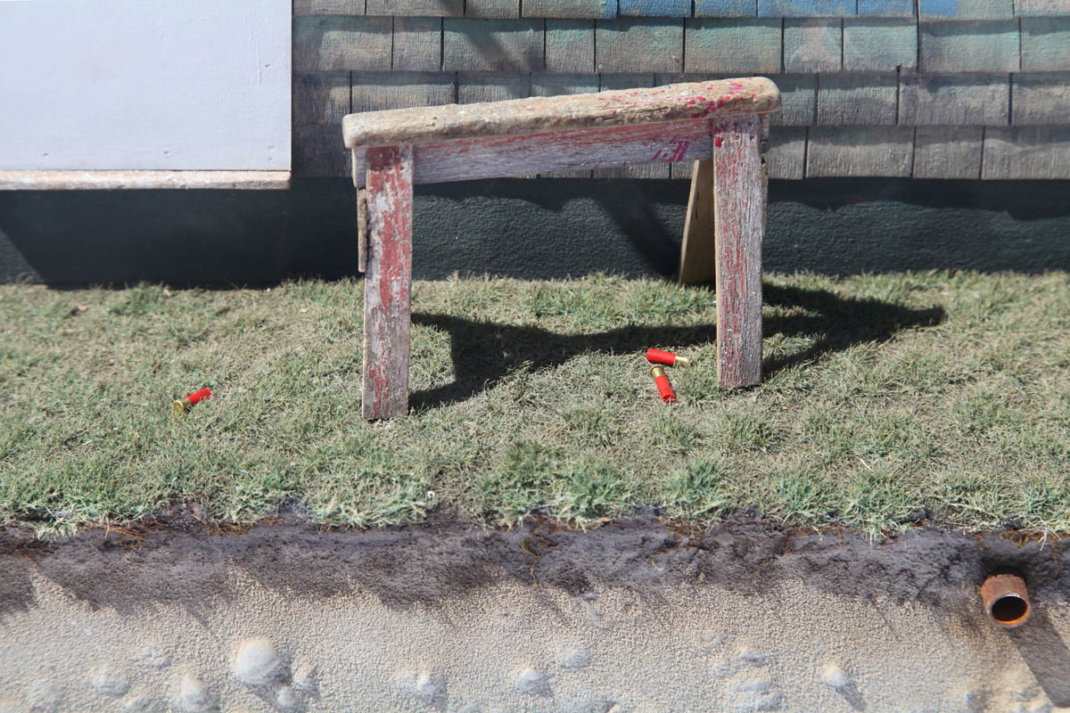
Cape Auguet, detail
LG: Who are some of the artists making dioramas you find most interesting or have been most influential?
Joe Landry Michael C. McMillon and Rick Araluce, both of whom have also created life-size dioramas. Also: Charles Matton; Andreas Rousounelis; Cesar Tirantino; Bruce Monteith; Oliver Noel; Randy Hage; Tim Prythero; Drew Leshko; Chuck Doan, whose realism surpasses reality, come to mind. There are many more.
LG: Where can we see your work? Will you be having any exhibitions soon?
Joe Landry At this time (July 2021), I have two new pieces in the Fitchburg Art Museum’s 85th Regional Show, Fitchburg MA, which runs through August. With a closing reception on Friday, August 27, 6:00pm to 8:00pm. I’ll also be showing work in gallery group shows throughout the Summer at the Kobalt Art Gallery in Provincetown, MA. Examples of my work online, across a number of disciplines, can be seen in the photo albums of my Joe Landry Facebook Homepage. And my early work in dioramas can be seen in my website: www.joelandryart.com
The post Interview with Joe Landry appeared first on Painting Perceptions.